
A safety consultant dashboard centralizes compliance data, inspection results, and leading indicators across every site a consultant manages, turning scattered records into timely preventive action. Safety consultants, multi-site safety managers, and contractor oversight teams rely on these tools to replace fragmented spreadsheets with one real-time view. The payoff is practical: faster corrective action, configurable risk indicators, and audit-ready records that hold up when a regulator asks for proof.
TL;DR:
- A safety consultant dashboard should include configurable leading indicators like near-miss response time and inspection rates, along with lagging measures such as injury reports.
- It must feature clear data provenance, drill-down capabilities, and permissioned multi-client views to ensure accurate, accountable, and scalable safety management.
- An effective pilot runs for two to four weeks across one to three sites, with success measured by decision-triggering event detection and user adoption.
- Dashboards should balance a small, focused KPI set—typically five to ten—favoring validity, reliability, and decision relevance over quantity.
- Platform features like mobile offline data entry, role-based access, and audit trails are essential for usability and regulatory compliance.
Table of Contents
- What a safety consultant dashboard is and how it fits a safety-management cycle
- Benefits: what consultant dashboards actually deliver
- Key features a consultant-grade safety dashboard must include
- KPIs and indicators: choosing leading vs lagging metrics
- How to evaluate a safety consultant dashboard: a practitioner checklist
- Design, usability, and testing: make dashboards a control, not decoration
- Pilot and rollout advice for consultants
- Practitioner notes on dashboards that actually get used
- How My Safety Solution supports consultant dashboard work
- FAQ
- Sources
What a safety consultant dashboard is and how it fits a safety-management cycle
A safety consultant dashboard is not a standalone report. It is the visible layer of a broader safety-management cycle that moves from policy and objectives, through risk management, into assurance, and back into promotion and training. When a dashboard is built around that cycle, every metric on screen connects to a decision somewhere in the organization. When it is not, you get a wall of charts that looks informative but does not change behavior.
Consultants have needs that differ from a single-site safety manager. They manage multiple clients across industries, each with its own hazard profile, contractor mix, and audit calendar. A dashboard built for consultant work needs to roll up data across clients while still letting a field supervisor drill into one site’s open corrective actions.
That means two distinct views matter:
- An executive summary view, showing compliance trends, open risks, and audit readiness across all managed sites.
- A field-action view, showing the specific inspections, training gaps, and corrective actions a supervisor needs to close this week.
Dashboards organized this way, rather than as disconnected charts, give consultants a tool that mirrors how safety-management cycles actually operate on the ground.
Benefits: what consultant dashboards actually deliver
The case for a dashboard rests on operational gains a consultant can point to when justifying the investment to a client’s leadership. The first is speed: leading indicators surface emerging risk before it becomes an incident, instead of after.
The second is time saved on paperwork. Digital, timestamped meeting and inspection records replace the manual scramble of assembling binders before an audit. The third is oversight at scale: roll-up metrics let a consultant see which of twelve client sites has the weakest contractor compliance without visiting each one. The fourth is follow-through, since a dashboard that tracks corrective actions, inspection completion, and training status keeps commitments from quietly expiring.
- Faster risk detection through configurable leading indicators tied to near misses and inspections.
- Reduced audit-prep time via digital, timestamped records instead of paper files.
- Multi-site roll-ups that flag weak contractor oversight before it becomes a violation.
- Automated tracking of corrective actions so fixes get closed, not forgotten.
Workplace injuries and illnesses in private industry totaled 2.5 million cases in 2024, down 3.1% from 2023, according to the Bureau of Labor Statistics. That downward trend reinforces why pairing leading indicators with lagging outcomes matters: a dashboard that only reports injuries after they happen is reporting history, not managing risk.
Key features a consultant-grade safety dashboard must include
Evaluating a platform or designing one for a client comes down to a short list of non-negotiable features. Miss one and the dashboard becomes a reporting exercise instead of a safety control.
- A configurable indicator library with filters by site and hazard profile, since a warehouse and a highway crew do not share the same risk picture.
- Multi-client and multi-site roll-up with permissioned views, so a consultant sees everything while a client sees only their own data.
- Drill-down capability from a summary chart down to the specific inspection, form, or signature behind it.
- Clear data provenance on every metric: who owns it, where it comes from, how often it updates, and an automatic timestamp.
- Action workflows that generate alerts, assign corrective actions, and attach evidence when a threshold is crossed.
- Mobile-first field input with offline capture, since deskless crews rarely have reliable signal at a jobsite.
Pro Tip: Before adopting a dashboard, ask the vendor to show you one metric end to end, from field entry to the alert it triggers, not just the finished chart.
Data provenance deserves particular attention because it is where most dashboards quietly fail. A chart showing “90% inspection completion” means little if no one can say which site, which week, or who entered it. Consultants managing several clients need that traceability built in, not bolted on later, because a regulator reviewing records during an audit will ask exactly those questions.

KPIs and indicators: choosing leading vs lagging metrics
Leading indicators measure the activities that prevent incidents: near-miss reporting, inspection completion, training attendance, and job-safety observations. Lagging indicators measure what already happened: injury rates, lost workdays, DART, and TRIR. Both matter, but they answer different questions, and a dashboard that leans on one alone gives an incomplete picture.
OSHA’s guidance on leading indicators lists near-miss tracking, training attendance, inspections, and job-safety observations as practical starting points, and recommends matching the indicator set to the maturity of the safety program rather than adopting every metric at once.
NIOSH cautions against overpopulating dashboards with metrics that do not inform a decision, recommending valid and reliable indicators tied directly to resource allocation and action. A dashboard with thirty indicators is not more rigorous than one with six. It is often just noisier.
A workable starter set for a consultant-configurable dashboard looks like this:
- Near-miss response time, measuring how quickly a reported near miss gets reviewed and acted on.
- Inspection completion rate, tracked against the schedule rather than just a running total.
- Training effectiveness checks, pairing attendance with a retention or field-observation follow-up.
- A paired lagging metric such as TRIR or DART to confirm whether the leading indicators are actually moving outcomes.
Pairing a small set of leading indicators with one or two lagging outcomes closes the loop: the leading metrics show whether the right activity is happening, and the lagging metric confirms whether that activity is reducing harm.
How to evaluate a safety consultant dashboard: a practitioner checklist
Before adding any KPI to a dashboard or signing off on a vendor’s platform, run it through a short checklist. This is the same discipline consultants apply when assessing a client’s 30-day compliance metrics: every metric earns its place only if it drives a decision.
- Definition: is the metric described clearly enough that two different people would measure it the same way?
- Owner: who is accountable when the number moves in the wrong direction?
- Data source: where does the number come from, and can that source be verified during an audit?
- Update frequency: does the metric refresh often enough to matter, or is it a monthly average masquerading as real-time?
- Threshold: at what value does the metric trigger a required action, not just a color change?
- Prescribed action: what happens the moment that threshold is crossed, and who is responsible for doing it?
Beyond the KPI-level check, evaluate the platform’s data quality and integration. Does it pull from sensors, paper or digital forms, HR and payroll systems, and incident-reporting tools, or does it rely on manual re-entry that introduces errors? Security and audit trails matter just as much: every record should be exportable in a format a regulator can review, with a clear history of who entered or edited it.
Governance is the piece consultants sometimes skip. Someone needs to own the indicator set itself, deciding who can add a new metric, who can change a threshold, and how often the whole dashboard gets reviewed for relevance. Without that sign-off process, dashboards tend to accumulate metrics the way email accumulates subscriptions: easy to add, hard to remove, and rarely revisited.
Design, usability, and testing: make dashboards a control, not decoration
A dashboard that looks polished but confuses the person reading it on a jobsite is not a safety control. It is decoration. A systematic review of dashboards used for safety data found that most dashboard development skips informatics and human-factors principles entirely, and that usability testing with actual end users is what determines whether a dashboard supports real decisions or just sits there.
Good design follows a few consistent principles: keep the layout simple, use purposeful comparisons rather than decorative charts, leave enough whitespace that the eye finds the important number quickly, and make the required action obvious without a legend.
- Test the dashboard with supervisors and field crews, not just the executives who approved the budget.
- Watch how long it takes someone to find the one number that matters and act on it.
- Build role-based entry points so a field worker sees a simple mobile screen while a consultant sees the full roll-up.
- Treat the first version as a draft: pilot it, collect feedback, and adjust the indicators and thresholds before scaling.
Pro Tip: Hand the dashboard to a field supervisor with no explanation and watch where they get stuck. That five-minute test reveals more than any vendor demo.
Executive-only visualizations are the most common failure mode. A chart that satisfies a leadership review but means nothing to the person who has to act on it has not improved safety. It has just moved the reporting burden somewhere else.
Pilot and rollout advice for consultants
Rolling out a dashboard across every client at once is how pilots fail quietly. A tighter approach works better.
- Scope the pilot to one to three sites, with a defined set of indicators and a two to four week duration, long enough to generate real data without losing momentum.
- Set success criteria in advance: data completeness, the number of decision-triggering events the dashboard actually caught, and how many field users logged in without being reminded.
- Watch for the common pitfalls: too many indicators diluting focus, data flows that break between the field and the dashboard, and low field buy-in because workers see the tool as surveillance rather than support.
- Once the pilot proves out, scale with governance in place: a review cadence, and indicator templates adapted by industry, whether public works or construction.
Starting with data a client already collects, rather than designing a perfect indicator set from scratch, shortens the path to a working pilot and avoids the cost of building new data flows before anyone has confirmed the dashboard is useful. The same logic applies outside safety software: facility teams that track preventive maintenance as a leading indicator, rather than waiting for equipment failure, follow the identical principle of catching small signals before they become incidents.
Practitioner notes on dashboards that actually get used
Most dashboard failures trace back to the same root cause: someone built a reporting tool and called it a safety control. The two are not the same thing. A reporting tool tells you what happened. A safety control changes what happens next, and that only works when the indicators are few, the thresholds are clear, and the person looking at the screen knows exactly what to do when a number crosses the line.
The consultants who get the most out of these tools treat the pilot phase as non-negotiable. They resist the client who wants thirty metrics on day one, and they insist on testing the dashboard with the crew that will actually use it, not just the office staff who approved the purchase. Platforms built specifically for multi-client consultant work, with mobile capture and audit-ready records baked in, remove much of the friction that used to make that discipline hard to maintain.
“A good consultant dashboard shows you exactly which client site is lagging before an incident occurs. We designed MySafetySolution to give safety professionals proactive risk visibility across all their contracted accounts.”
— Matthew Hoffman, President - MySafetySolution
How My Safety Solution supports consultant dashboard work
Consultants managing several clients need a platform that handles the operational complexity spreadsheets were never built for. My Safety Solution replaces the patchwork of paper sign-in sheets, scattered spreadsheets, and inconsistent toolbox talks with one centralized dashboard built for exactly that multi-client work: automated OSHA compliance tracking, digital attendance records with signatures and timestamps, and AI-generated safety topics drawn from a preloaded NLTAPA-compliant library.
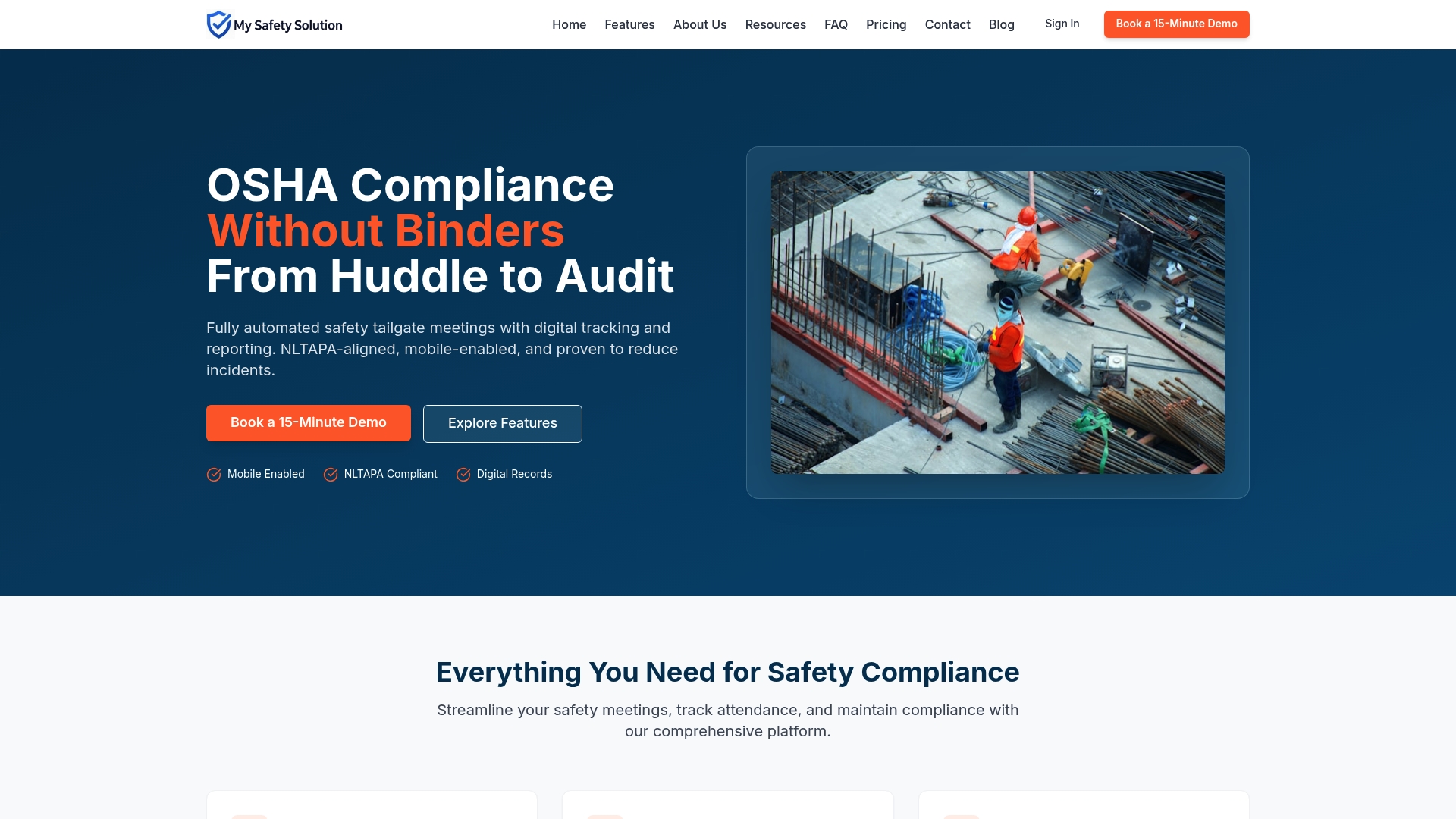
The platform maps directly onto the evaluation checklist above. Role-based permissions give consultants, admins, managers, and workers their own view. Mobile-first meeting capture works in the field, not just at a desk, and every record carries the audit trail a regulator will want to see. Multi-company management means a consultant can oversee every client’s compliance status from one login instead of a dozen.
Plans scale with team size and feature access, from Starter at $99 per month to Growth, Business, and Enterprise. Consultants evaluating a new workflow can start with a focused pilot on one or two clients before expanding. To see how the dashboard fits your caseload, visit the My Safety Solution platform overview or reach out through Mysafetysolution to set up a demo.
FAQ
What is a safety consultant dashboard used for?
A safety consultant dashboard centralizes compliance data, inspection results, and leading indicators across multiple client sites in one view. It lets a consultant spot emerging risks, track corrective actions, and produce audit-ready records without juggling separate spreadsheets for each client.
What is the difference between leading and lagging safety indicators?
Leading indicators, such as near-miss reports and inspection completion rates, measure the preventive activity happening before an incident. Lagging indicators, such as TRIR and DART, measure outcomes after the fact. Consultants typically pair a small set of both so leading activity can be checked against actual results.
How long should a dashboard pilot run before full rollout?
A pilot scoped to one to three sites over two to four weeks is generally long enough to confirm whether the data flows work and whether field staff are actually adopting the tool. Shorter pilots often miss slow-forming data gaps, while longer ones delay useful feedback.
How many KPIs should a safety dashboard track?
There is no fixed number, but NIOSH guidance warns against adding every available metric and recommends indicators that are valid, reliable, and tied to specific decisions. Most working dashboards stay lean, often five to ten core indicators, rather than dozens.
Does My Safety Solution offer a dashboard for consultants managing multiple clients?
Yes, My Safety Solution includes multi-company management so consultants can oversee compliance status, attendance records, and safety meeting data across several clients from a single dashboard. Pricing is available on the My Safety Solution pricing page.
Sources
For deeper reading, consult OSHA’s leading-indicator guidance, NIOSH’s measurement bulletins, the PubMed systematic review on dashboard usability, and current BLS injury data.
- What measures can companies use to evaluate safety management practices and identify opportunities for improvement? | NIOSH
- Dashboards for visual display of patient safety data: a systematic review
- U.S. Bureau of Labor Statistics: 2.5 million workplace injuries and illnesses in private industry in 2024, down 3.1 percent from 2023