
A safety dashboard is a visual reporting tool that consolidates critical workplace safety and compliance metrics into a single, real-time view. Safety professionals use these dashboards to monitor incident trends, track training completion, verify corrective actions, and demonstrate OSHA compliance without digging through scattered spreadsheets or disconnected reports. The best safety dashboard examples combine leading indicators like hazard identification with lagging indicators like Total Recordable Incident Rate (TRIR), giving safety managers and executives the full picture they need to make decisions that protect workers and reduce liability.
What are the essential features of effective safety dashboards?
Effective safety dashboards start by defining 8–10 core KPIs mapped to specific data sources such as incident logs, training records, and hazard reports. Without that mapping, a dashboard displays numbers without context, and context is what drives corrective action. Dashboards typically include 10–15 visual charts that monitor trends, compare performance against benchmarks, and correlate leading and lagging metrics. That volume of visual data requires deliberate design to stay readable.
The following features separate functional dashboards from ones that collect dust:
- Role-based access. Site managers see daily operational data. Executives see aggregated performance across all locations. Neither audience benefits from the other’s view.
- RAG color coding. Red, amber, and green status indicators let any viewer identify problems at a glance without reading raw numbers.
- Leading and lagging indicators. Leading indicators predict risk. Lagging indicators confirm outcomes. Both belong on a complete dashboard.
- Integrated data sources. Incident logs, training records, audit results, and hazard reports must feed the dashboard automatically, not manually.
- Multi-location roll-ups. Organizations with multiple sites need aggregated views that allow drilling down to individual locations without switching platforms.
- Trend charts and benchmark comparisons. A single data point means little. Trends over 12 months against Bureau of Labor Statistics benchmarks reveal whether performance is improving or eroding.
Pro Tip: Build your dashboard around decisions, not data. Before adding any metric, ask: “What action will this number trigger?” If the answer is unclear, the metric does not belong on the primary view.
Integrated dashboards reduce reliance on scattered reports and allow safety teams to act faster on emerging issues. That speed matters most when a hazard is escalating and every hour of delay increases exposure.

Top 7 safety dashboard examples and what each one tracks
Safety dashboards are not one-size-fits-all tools. Each type serves a distinct purpose and audience. The seven examples below represent the most common and effective configurations used by safety professionals across construction, manufacturing, utilities, and public works.
1. Injury and incident trends dashboard
This dashboard tracks recordable injuries, near-misses, first-aid cases, and lost-time events over time. It plots TRIR and DART rates monthly and compares them against industry benchmarks from the Bureau of Labor Statistics. Safety managers use it to identify whether incident frequency is rising before it becomes a regulatory problem.
2. Training completion and certification tracking dashboard
This view monitors which employees have completed required safety training, which certifications are expiring, and which sites have compliance gaps. It pulls directly from training records and sends alerts when completion rates fall below defined thresholds. Construction and manufacturing organizations with large deskless workforces rely on this dashboard to maintain OSHA training compliance across crews that rotate frequently.
3. Critical control verification dashboard
Critical controls are the specific barriers that prevent fatalities and serious injuries. This dashboard tracks whether those controls are being verified in the field, not just documented on paper. It shows verification rates by site, by control type, and by supervisor. Control strength and critical-control verification give boards a more accurate picture of real risk than injury counts alone.
4. Hazard and near-miss reporting dashboard
This dashboard measures the volume and quality of hazard reports submitted by workers. High reporting rates signal a healthy safety culture. Low rates signal either a safe environment or, more commonly, a culture where workers do not trust the reporting process. The dashboard tracks open hazards, time to resolution, and repeat findings by location.
“Dashboards should expose issues like unresolved high-risk exposures, repeated findings after closure, and supervisor challenge quality. Linking metrics to ownership, required resources, and verification drives real culture change.”
5. Compliance audit and inspection status dashboard
This view tracks scheduled versus completed inspections, open corrective actions, and overdue items by site and category. It gives compliance officers a real-time audit trail without manual compilation. One-click audit-ready reporting replaces the manual spreadsheet tracking that consumes hours each week. That time savings lets safety managers focus on field presence rather than administrative catch-up.
6. Safety investment and corrective action tracking dashboard
This dashboard connects corrective actions to resource allocation. It shows which findings have been closed, which remain open past their due dates, and what budget or labor has been assigned to each. Boards use this view to evaluate whether safety investments are translating into resolved risks or accumulating as unresolved liabilities.
7. Executive summary dashboard with leading indicators
The executive summary dashboard presents a command-center view of organizational safety performance. It surfaces control strength, reporting trust scores, and decision conversion rates alongside traditional injury metrics. Leading indicators that change decisions deliver stronger safety intelligence than simple counts of observations or trainings completed. This dashboard is designed for monthly board review and strategic resource allocation.
How multi-location safety dashboards improve compliance oversight
A multi-location safety dashboard gives executives a consolidated view of safety performance across every facility, job site, or fleet without requiring manual data aggregation. Multi-site dashboards provide site managers with detailed daily operational compliance views while executives receive a command-center perspective that spans the entire organization. That dual-layer design is what makes multi-location reporting genuinely useful rather than just visually impressive.
The table below shows how dashboard views differ by role in a multi-site organization:
| Role | Dashboard View | Primary Metrics |
|---|---|---|
| Site manager | Site-specific daily operations | Open hazards, training gaps, inspection status |
| Regional manager | Multi-site roll-up by region | Incident trends, corrective action rates |
| Executive / board | Organization-wide command center | TRIR, control strength, reporting trust |
| Compliance officer | Audit and inspection tracker | Overdue items, closure rates, audit trail |
Drilling down from the executive view to a single site takes one click in a well-designed multi-location dashboard. That drill-down capability is the difference between a dashboard that identifies a problem and one that helps a manager locate and fix it. Without it, executives see that something is wrong but cannot act with specificity.
Pro Tip: Filter your multi-location dashboard by incident category, not just by site. A pattern of struck-by incidents across three unrelated locations points to a systemic equipment or training issue, not a site-specific failure.
Audit-ready reporting is the most immediate operational benefit of multi-site safety software. When OSHA requests records, a compliance officer with a centralized dashboard can produce documentation in minutes rather than days.
What leading and lagging safety metrics matter most in 2026?
Safety dashboard metrics fall into two categories, and most organizations track too many of the wrong type. Lagging indicators confirm what already happened. Leading indicators predict what is about to happen. The most effective dashboards in 2026 weight both, but prioritize leading indicators that are directly tied to decisions.
The lagging indicators every dashboard should include:
- TRIR (Total Recordable Incident Rate). The standard OSHA metric for recordable injuries per 100 full-time workers.
- DART rate. Days Away, Restricted, or Transferred cases per 100 workers. Measures severity, not just frequency.
- Lost-time injury frequency. Tracks incidents serious enough to remove a worker from duty.
- Fatality and serious injury count. Non-negotiable for board-level reporting.
The leading indicators that drive proactive decisions:
- Hazard identification rate. How many hazards workers report per shift or per site visit.
- Training completion percentage. The share of required training completed on schedule, by site and crew.
- Critical control verification rate. How consistently field supervisors verify that fatal-risk controls are in place.
- Corrective action closure rate. The percentage of identified issues resolved within their target timeframe.
- Reporting trust index. A measure of whether workers believe reporting hazards leads to action, not retaliation.
Boards prefer metrics on control strength and unresolved exposures linked to resource allocation over basic injury frequency data. That preference reflects a shift in how boards understand safety risk. Injury counts tell you what happened last quarter. Control verification rates tell you what is likely to happen next quarter. Combining lagging and leading indicators in a single dashboard view gives safety leaders the full picture needed to allocate resources before an incident occurs, not after.
Key takeaways
Effective safety dashboards combine leading and lagging indicators, role-based access, and multi-location reporting to give safety professionals the visibility needed to prevent incidents and maintain OSHA compliance.
| Point | Details |
|---|---|
| Define 8–10 core KPIs first | Map each metric to a specific data source before building any dashboard view. |
| Separate views by role | Site managers need daily operational data; executives need organization-wide trends. |
| Prioritize leading indicators | Metrics like hazard identification and control verification predict risk before incidents occur. |
| Use multi-location roll-ups | Consolidated views with drill-down capability turn data into site-specific corrective action. |
| Link every metric to a decision | Metrics that do not change decisions waste dashboard space and management attention. |
What most safety dashboards get wrong
Safety professionals spend years building dashboards that report on the past. TRIR goes up, the board asks questions, and the safety team scrambles to explain an incident that happened six weeks ago. That cycle is not safety management. It is incident documentation dressed up as a dashboard.
The dashboards that actually change outcomes are built around the question: “What decision does this metric support?” A training completion rate sitting at 74% is not just a number. It is a signal that 26% of a crew may be operating without the knowledge to recognize a specific hazard. That gap demands a decision, not a note in the monthly report.
I have seen organizations invest heavily in dashboard technology and still fail to reduce incidents because the metrics they tracked did not connect to field behavior. The critical control verification rate is the single most underused metric in safety dashboards. Most organizations know their TRIR. Very few can tell you whether their supervisors are actually verifying that energy isolation procedures are followed before maintenance begins. That verification gap is where fatalities happen.
The other mistake is building dashboards for compliance rather than for culture. A dashboard that exists to satisfy an OSHA audit looks very different from one that a site supervisor checks every morning before the crew starts work. The best safety reporting tools serve both purposes, but the design must start with the field user, not the auditor. When field supervisors trust the data and act on it daily, the compliance record takes care of itself.
“Safety dashboards should drive field action, not just display vanity charts. MySafetySolution focuses on leading compliance indicators, giving officers the operational insight needed to prevent citations and injuries.”
— Matthew Hoffman, President - MySafetySolution
My Safety Solution supports real-time safety dashboards
Safety professionals managing deskless workforces across multiple sites need more than a reporting tool. They need a system that captures data at the point of work and surfaces it in a dashboard that drives decisions.
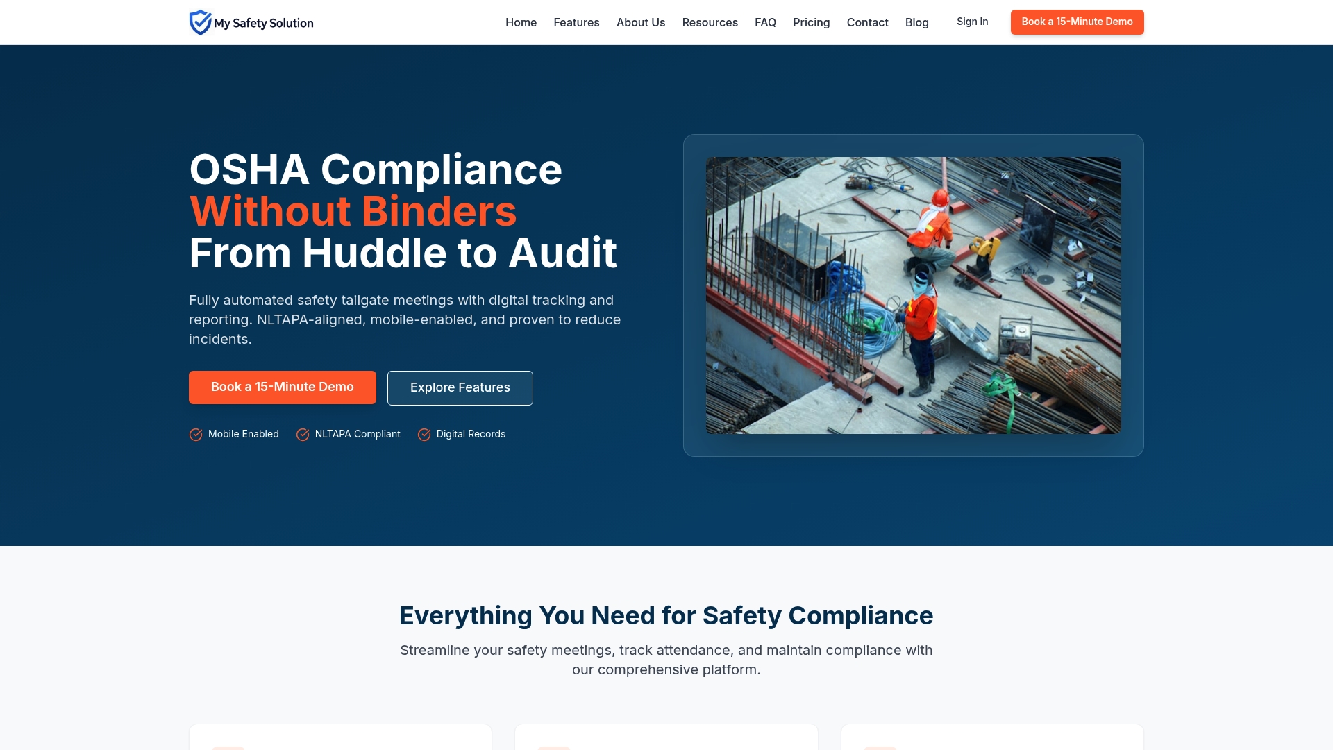
My Safety Solution delivers role-based safety dashboards built for construction, manufacturing, utilities, and trucking operations. The platform tracks training completion, meeting attendance, corrective actions, and OSHA compliance records in real time, across every site, without manual data entry. AI-powered content generation keeps safety meetings relevant and documented. Multi-location reporting gives executives the command-center view they need and gives site managers the operational detail they act on daily. Companies using My Safety Solution report reduced incident rates and stronger compliance records. Learn more about OSHA compliance meeting software designed for high-risk workforces.
FAQ
What are the most common safety dashboard examples?
The most common safety dashboard types include injury and incident trend dashboards, training completion trackers, compliance audit status views, hazard and near-miss reporting dashboards, and executive summary dashboards with leading indicators.
What metrics should a safety metrics dashboard always include?
Every safety metrics dashboard should include TRIR, DART rate, training completion percentage, corrective action closure rate, and at least one leading indicator such as hazard identification rate or critical control verification rate.
How does a multi-location safety dashboard work?
A multi-location safety dashboard aggregates data from all sites into a single view, with role-based access that lets executives see organization-wide trends and site managers drill down into location-specific operational data.
What is the difference between leading and lagging safety indicators?
Lagging indicators like TRIR measure incidents that already occurred. Leading indicators like hazard identification rates and training completion measure conditions that predict future incidents, giving safety teams time to intervene.
How often should safety dashboards be reviewed?
Site managers should review operational dashboards daily. Executives and compliance officers should review aggregated safety performance dashboards at least monthly, with board-level reporting aligned to quarterly or monthly governance cycles.